What do you think? I know these posts have thus far been very light-hearted (as makeup generally is), but when I began writing this, I just felt like I couldn't ignore the issues that come from packaging such as this. A lot has changed in 20 years and what was acceptable or not a big deal back then, isn't the same as now.
Friday, 26 March 2021
Flashback Beauty Friday 17: Urban Decay Lipstick History
Post contains affiliate link, no PR gifted products.
Slightly different format for you this week as we take a look back over multiple eras rather than one specific item. Firstly, if you missed the double nostalgia whammy of cassette tapes and retro Hard Candy palette last week, then have a read of that. Flashback Beauty Friday is a weekly trip down beauty memory lane, specifically limited edition or discontinued items and their packaging. Like I say, I'm doing something a bit different this week (it wasn't my intention, it just happened) and actually I've ended up taking some more photos to add to this post, so we can have a real history and discussion on the present and past.
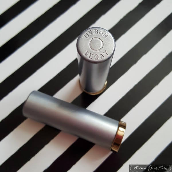
So this week, I thought I'd dig out my Urban Decay lipsticks (well just a few, I have many more shades) and take a look at how their lipstick packaging has evolved over the years. The first thing that comes into my mind when thinking about UD lipsticks, is the old 'bullet' casing. We often refer to actual lipsticks as "bullets" but UD took it very literally in the 90's with this ammunition style format.
The cases were metal, hard, cold to the touch and completely plain other than the brand name engraved onto the tip of the lid with a circle in the centre. Google "bullet casing" images and you'll probably struggle to tell them apart from this lipstick. Self coloured shade name stickers were placed on the base of the lipstick and the bullet itself had an oval shaped tip, rounded on both sides, which once more looked very bullet-like peeking out of the casing. The part you twist up was gold with just a small part, slightly wider than the case, sticking out from the lid, which was non-shine silver.
These lipsticks really lived up to the "Urban Decay" name; they were a far cry from other cosmetics styles at that time. They weren't pretty, they weren't something that would look cute on your dressing table or in your makeup bag. They were tough, gritty and in all honesty, not even immediately identifiable as makeup. Even the box (which I no longer have), was rough looking cardboard with a punky, scribbly font. Did that make them outcasts among other brands and us, the consumer? Honestly, no. UD were seen as an edgy brand, a refreshing change and 20 odd years ago, sans "woke" generation and PC brigade, this packaging was actually coveted. As much as I loved that peak* UD era (*I personally think they've had a revival of late, but back in the 90's/early 00's UD was the bomb), it's "I don't care" attitude and unwillingness to conform to beauty aesthetics of that time, a lipstick shaped liked ammunition is very obviously problematic.
While I'm definitely not saying gun violence didn't exist back then, it was not unusual to see references to weapons in the likes of fashion (i.e. gun charms on jewellery or ammunition inspired belts or even 2009's Chanel gun heeled shoes) and in music (lyrics, videos and print), however it was no surprise that UD had to adapt this packaging at some point.
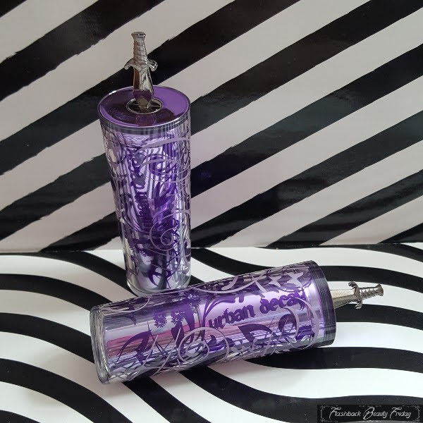
There was quite a gap before they launched their next era of lipsticks. More than 20 shades hit shelves in 2008 and whilst the bullet style packaging was a thing of the past, they still couldn't leave that 'bad' theme behind! Other than the link to dangerous themes, this casing had no resemblance of it's predecessor whatsoever.
The lid was actually the base of the lipstick, how it would stand if stored upright. It was clear with a swirly pattern of flowers and butterflies in varying purple shades, a stark contrast to the previous design. The lid base bears the shade name, again on a corresponding coloured sticker. The lid tapers at that end but expands to where the lipstick is inserted, which then sits completely flush inside the case.
The lipstick component is in shiny purple and the bit I dislike is the shade name on a clear sticker. Normally you'd have the shade name on the base of the lipstick portion, however the way this is designed it would be very easy to mix up the lipstick shades as they have no identifier on them as the shade is on the lid instead. It makes it look like tester packaging in my opinion, I don't like it, but I understand why it was necessary. It could've been better executed though.
The reason these lipsticks use the lid as their base is because they can't stand up the other way because of the small dagger penetrating the top (or base?!) of the lippie. Inappropriate connotations aside, it's actually quite adorable because it's so tiny and intricate. The UD name is written on the base around the dagger as well as on the side of the lid in a bold gothic font.
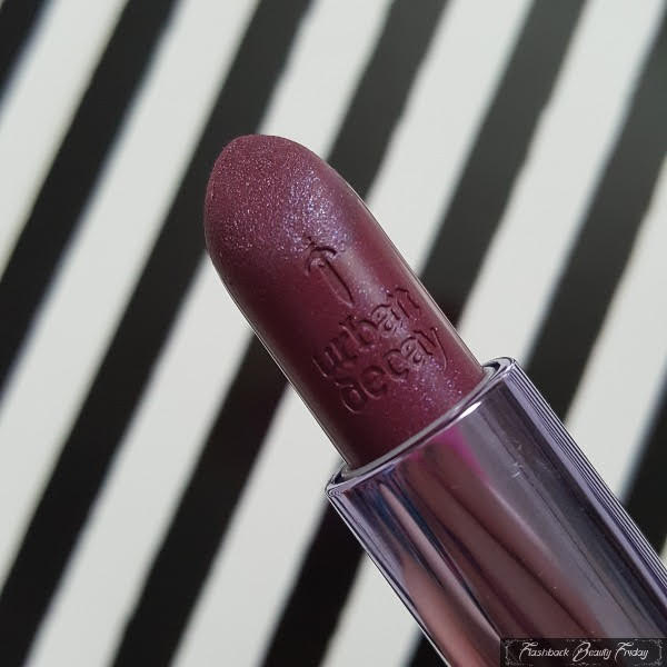
The lipstick bullet also contains a knife reference with "Urban Decay" and the dagger etched into it. The lipstick is differently shaped to the original, now with a flat teardrop tip on the rounded shape.
Overall this casing is the most beautiful, but also quite cumbersome. It's chunkier and longer than the others (and indeed most other lipstick brands) and that dagger probably isn't particularly handbag friendly. Purple has long been a colour I associate with UD, so that part makes sense, but the butterfly and floral design feels a bit off-brand and is in stark contradiction to the daggers. Maybe that was their intention, I don't know. I feel like UD were at this point, leaning more glam-goth than edgy punk.
I don't have any of the Revolution lipsticks that followed in 2013. The lipstick itself took on a different shape with a slanted flat top. The twisty part was high-shine purple and the outer casing was more like the current form, in a mirror pewter with Urban Decay engraved on the side and UD on the top of the lid. Those cases split in the middle, keeping the same width for the base and lid all the way down.
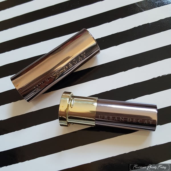
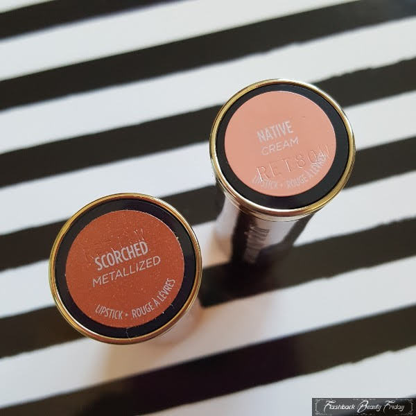
Come 2016 and the Revolution lippies were being replaced by Vice lipsticks. These (apparently) came in over 100 shades and 6 finishes. The packaging has remained the same since then and I have a couple of mine here to show you. The more orangey case was a special release in 2017, but the regular line up feature the pewter cases.
A lot of people still find this case inappropriate because it harks back to that original bullet shape. I personally don't make the ammunition comparison with this one. It has this smooth but uneven surface, which I see more as something melting, but maybe to others it looks like a fired, bent bullet.
The outer pewter casing has UD engraved on the top of the lid with Urban Decay down the side. Inside is gold and silver with Urban Decay printed this time on the twisty party. The lipstick doesn't have the same weight or cold feeling as the original and generally to me anyway, feels less edgy and less urban.
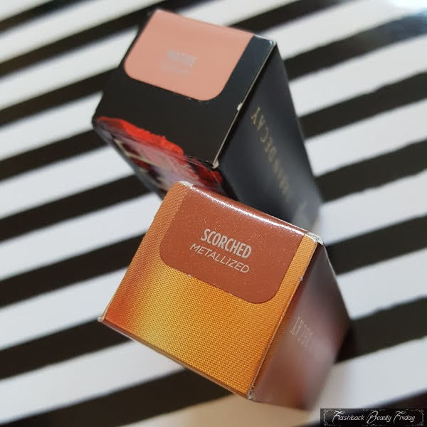
The same (handy) self coloured shade name stickers are on the base with the lipstick finish underneath and even the outer box bears the correct colour of sticker, again with shade name and finish. So storing multiples of these and finding the correct shade is relatively easy.
The chunky lipstick bullet has the teardrop shaped flat tip again and UD engraved on the side.
It's slimmer than the purple case (which wouldn't be hard), but it just doesn't feel as 'threatening' to me as the original bullet. It's a bit more sophisticated I suppose.
Urban Decay have had shades names over the years such as, Junkie, Streak, Strip, Naked, F-bomb, Safe Word, Perversion, Turn On and Jailbait, so it's unsurprising their packaging has been so controversial. It's what they do or rather what they did. Apparently though, when the Vice lippies launched in 2016, counter staff were given ammunition style gun belts to sling over their bodies to hold and promote the lipsticks (so I guess they are still supposed to be ammunition-like). At the time there had been a number of high profile shootings, so it wasn't mandatory for staff to wear them. I'm a bit taken aback that as recent as 5 years ago, they were making foolish decisions such as this. Back in the 90's it wasn't such a big deal to own a lipstick shaped like ammunition, but I think we've all grown up to just not find that funny or 'edgy' anymore, so I am surprised they keep making the same mindless choices. At the very least, it's irresponsible to glamourize weapons and violence and even if that wasn't their intention, which I'd like to think it wasn't, there's no denying this does that. Here's me going "awww, look at the cute wee dagger", it's just not right. It would make me pretty uncomfortable to see teenagers carrying shell casing style lipsticks nowadays or could you imagine explaining this to airport security when your bags are scanned? That said, I can also see the argument where people say "it's only makeup", "it's not dangerous, it's lipstick, it won't hurt you, what harm is there to it?". It is "just makeup" and I wish we lived in a world where real bullets opened up to reveal colourful lipstick inside, but sadly we don't and I'd rather not be reminded of violent death every time I open my makeup bag.
Labels:
beauty
,
cosmetics
,
flashback beauty friday
,
lipstick
,
stash pics lipstick
,
urban decay
Subscribe to:
Post Comments
(
Atom
)










OMG how cool are these! Yes sadly a lot has changed :-(
ReplyDelete