Pages
▼
Friday, 22 July 2022
Flashback Beauty Friday 81: MAC x Alexander McQueen Eyeshadows
Post does not contain affiliate links or PR gifted items.
Finally, a night I could sleep with clothes on and even a thin blanket at times. I've really been suffering in this heat the past wee while, I'm not enjoying it at all. I'm fine without rain and like the bright sky, but I can't stand being too hot. I was able to take some photos yesterday of a collection I've been meaning to share for Flashback Beauty Friday for a while now, but there's too many photos to get through today, so I'll save it for next week. Last time, was the pretty Paul & Joe hummingbird print on a fan and lipstick, today it's another fusion between fashion and beauty.
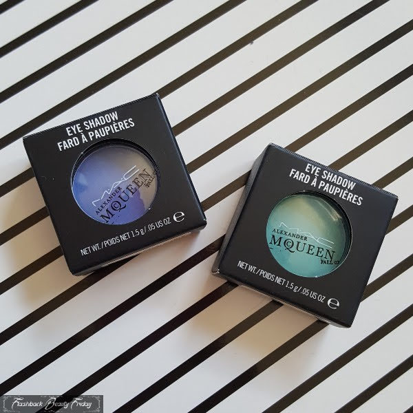
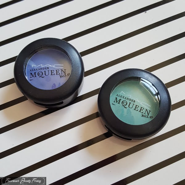
MAC have had many varied collaborations over the years and for Autumn 2007, they went backstage with renowned fashion designer Alexander McQueen. Having worked on his shows since 1996, this 16 piece collection included many shades specifically blended for the AW07 runway. It was a joint effort by, at the time, Charlotte Tilbury, leading makeup artist and Terry Barber, MAC Director of Makeup Artistry. AM was known for his theatrical shows that bucked the overly pretty aesthetic, instead finding beauty in non-conventional, often very dark themes. Alexander McQueen Fall 07 was stamped on the packaging and it definitely feels like you've just pinched this from the dressing table backstage.
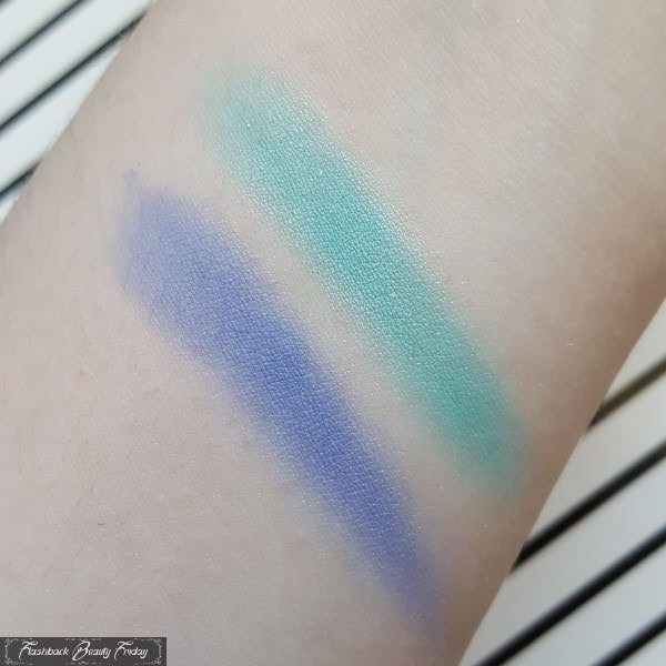
The eye colours really excited me and I bought both Nile and Haunting from the line and now that I think of it, I'm sure I have Otherworldly Paint Pot too. Sadly, this was the first time I was disappointed with MAC. Both of the colours lack pigmentation and need a lot of building and work to get remotely close to how beautiful they are in the pan. Both have satin finishes, but are almost matte with a soft, diffused look. I think this can sometimes make them look and feel a bit chalky. The blue, I remember being particularly difficult to work with and I was just so disappointed as I had high hopes for both colours.
For my swatches, I did need to keep layering. The satin sheen you can see in places is less prominent in person. Nile is a bright blue with purple tone to it, slightly more blue and deeper than what I'd call Periwinkle or Cornflower Blue. MAC described it as a soft, royal blue with white pearl. Haunting described as a seafoam green is a bright, light turquoise, definitely more green than blue. As always, I haven't altered this photo other than resizing. Swatches are applied dry with a finger and no primer and as I said, heavily layered!
The green reminds me of Elizabeth Taylor in Cleopatra, which was unsurprisingly the inspiration and so clearly recognisable with that lash to brow colour and heavily applied liner. To be honest neither were as bad as I remembered them to be, I thought they were impossible to work with. They're not, there's definitely potential, I've just never cared much for makeup that really needs patience and time. Maybe I should play around more with these now and see if my original opinion can be changed.


No comments:
Post a Comment
Wowee your comments cheer me up!
Unfortunately I've had to disable anonymous comments for now, due to a high volume of spam.